
Navigator
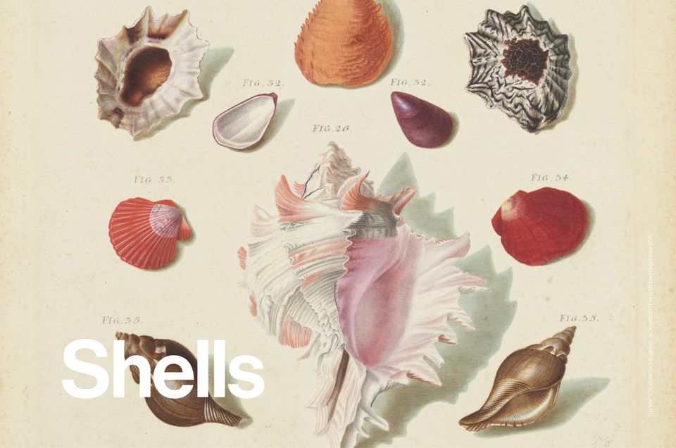
Shell motifs resurface in design, from Rococo-inspired furniture to modern fashion and architecture. Once a symbol of luxury, now a reflection on marine fragility and sustainability.
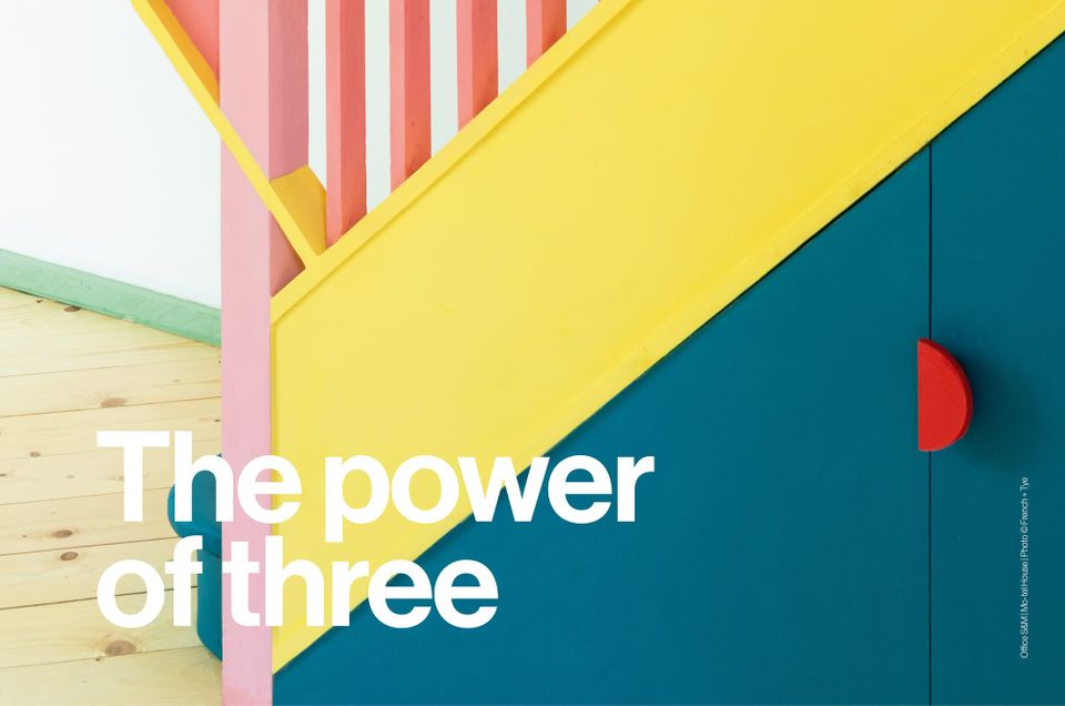
By exploring the principles of colour theory we are able to create palettes that set our personal tastes to one side. In this essay, we focus on the science behind triadic schemes and what history can teach us about creating colour harmony with three main colours.
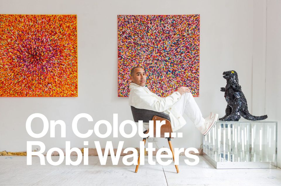
Discarded flyers and broken vinyl are but some of the abandoned materials transformed by collage artist Robi Walters.
With an extraordinary archive and enviable reputation, Britain’s oldest family owned and run paint and polishes manufacturer Mylands is getting on with business.
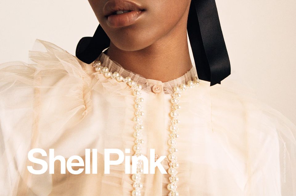
Previous iterations of Shell Pink have grouped it in similar tonal pairings, earning this colour an underserved reputation as a safe if uninspiring choice. Now though, designers are subverting previous associations, developing a new edginess to previous prettiness.
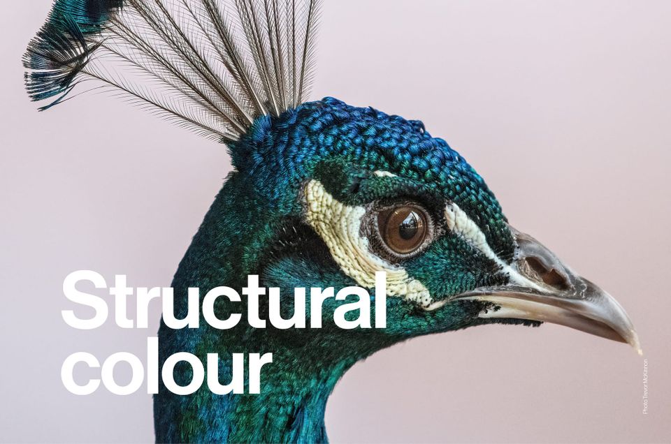
As we continue to strive for a more circular economy in the design world, could nature hold the answer to sustainable alternatives for pigments and dyes when considering colour application? Here, we discuss the natural phenomenon of structural colour and a biomimetic approach to design.
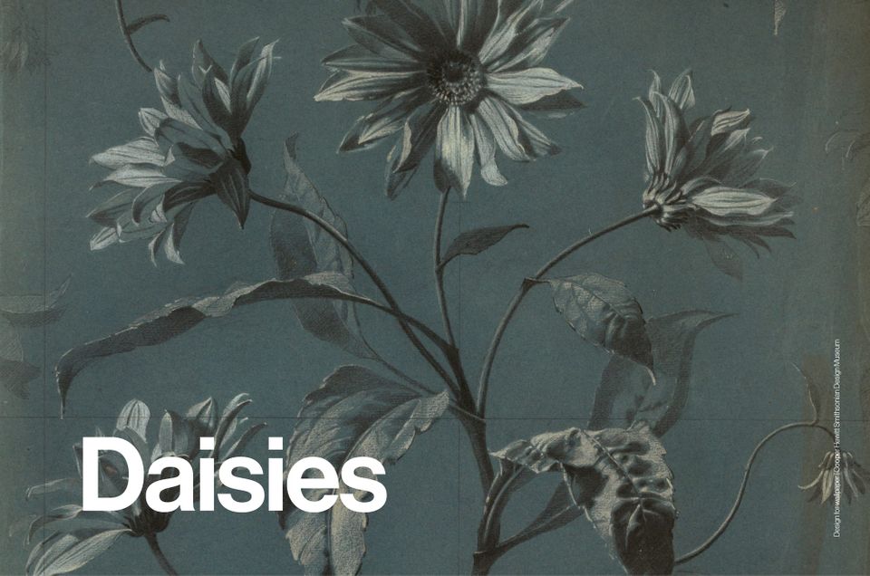
A symbol of youth and optimism, the daisy motif resurfaces across fashion and design, from vintage-inspired prints to nostalgic homages to Mary Quant’s iconic 1960s aesthetic.
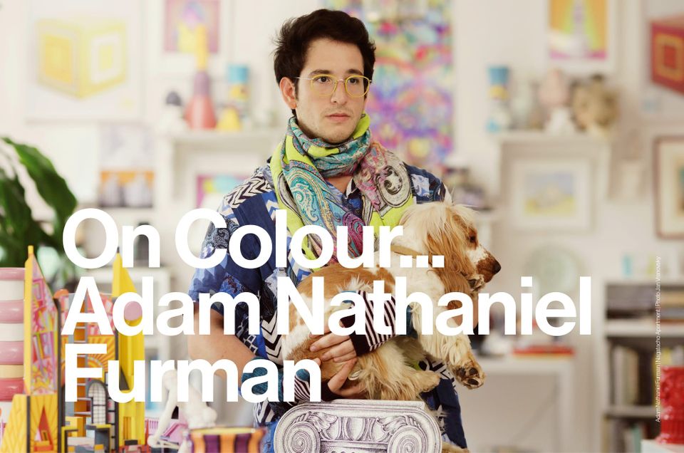
Bold colour, intuitive palettes and influences spanning Japanese aesthetics, Argentine culture and Italian art. Adam Nathaniel Furman’s approach puts colour at the centre of every project.
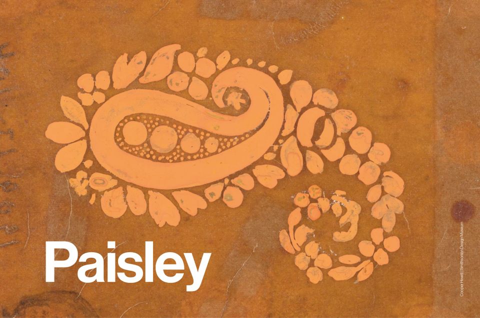
Paisley’s long history, from Persian symbolism to 1960s psychedelia, resurfaces in fashion and interiors. Dior, Gucci and Etro reinterpret the motif, balancing nostalgia with new relevance.